SEPTIC MASTERS


“These guys go beyond the scope of what might be their obligation. They help us in so many ways that I feel like we can truly call them a partner because they have become an extension of our team. They have provided and continue to provide sound advice in promoting and growing our company. They have delivered excellent communications including a complete rebranding of the company and new website.  I remain impressed, grateful and very excited about our future.  We are in great hands with High Ground.”

– Paul Beachy, Operations Manager

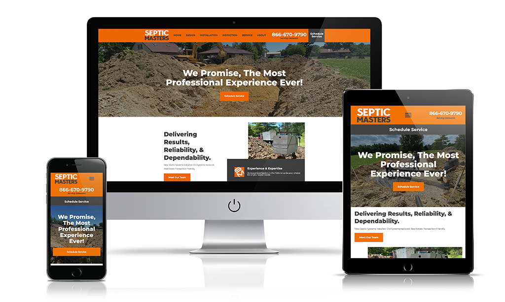
Our client acquired a local septic company and wanted to change the name and create an entirely new brand. We were asked to create a brand that looked and presented itself as having been in business for a long time…because it had. Even though the company name was new, the individuals who were going to be operating the company had been around a long time in the Septic Industry. They’ve had proven success and had over 2000 installations. We took the challenge.

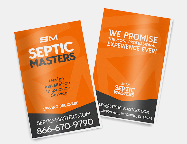
We met with the principals of the company and had initial strategy conversations about what to call the company. After a few hours, the name Septic Masters was unanimously the winner! So, we began with creating a visual representation of the company…the logo!

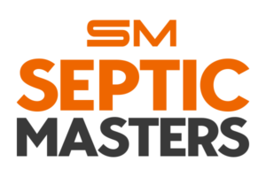
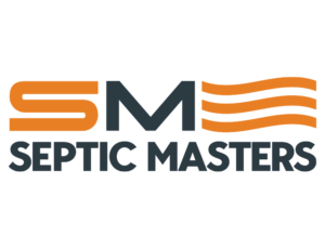
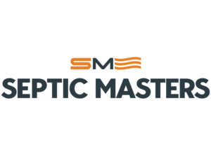
Before we begin working on a logo, we always have a very detailed Q&A with our client to see if they have any sketches or ideas for their logo. We discuss what they like and what they don’t like. Below are some initial versions of the logo that we presented to our client.

We use the “wiggly” lines initially as an abstract logo mark that represented water which flows through septic systems. That mark would be used next to the “SM” and eventually as the brand grew in recognition, by itself. They loved the SM but not the wiggly. Our client felt that it was too abstract.

After another conversation we brought up the idea of the mark to resemble an actual septic system. We knew that when we looked at a septic system from above, they resembled a fork. The folks at Septic Masters loved the idea and gave us the green light so in round 2 we incorporated that design. They didn’t hate it but they did not love it.

One thing that we always say to our clients when it comes to their logo is that if they don’t love it, we keep going. So we kept going.

"These Guys Go Beyond the Scope of What Might Be Their Obligation."

The final design was actually already there in all the rounds. We ended up doing away with the wiggly and the septic fork, leaving the “SM” by itself. Simple but strong!

Our clients loved it! Now that we had the colors chosen and the logo decided on, we used that as the foundation for the rest.